What.
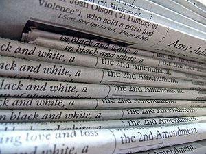
While We Were Here is a 16-page free souvenir newspaper with a print run of 4,000. It was put together by a small team of volunteers during this year’s Greenbelt Festival. It included a 4-page black and white comic pull-out in the centre of the paper. You can download a copy of the main paper or the comic in PDF formats.
Where.
Greenbelt Festival takes place over four days at the end of August every year at Cheltenham race course. There’s no accommodation on site that’s not under canvas – so the newspaper team were camping out on the course along with about 20,000 other festival-goers. We appropriated a small box that’s normally used for watching the races and turned it into a newsroom, with two design Macs and three or four laptops at any given time. There were not enough chairs, the carpet went half-way up the walls, and we were constantly watched by pictures of small men on large horses.
Who.
In total there were ten people involved in making the main paper. We didn’t have much to do with the comic guys – they did their own thing and arrived perfectly on time with all their spreads in PDF form. Our team was brought together by Matt Patterson as hands-on managing editor and James Stewart as hands-off. I was the editor. James Weiner and Paul Abbott worked on data and infographics for the paper. Ben Weiner, Will Quirk, Geraldine Nassieu-Maupas and Oliver Mayes made up our design and layout team, and Wilf Whitty dealt with some last-minute front-cover design issues.
The rest of the team were primarily design-minded folks and I was (as far as I know) the only one with newsroom experience. As a result partly of that and partly the fact that I’ll organise anything if it stands still near me for long enough, I took charge of content planning and making sure we had something interesting, well-written and appropriate for print on every page.
Why.
As a tangible souvenir, something to commemorate the experience of being at Greenbelt for those who were there and something to express a little of what it was like for those who weren’t. Something that’s separate from the blog or the Flickr stream or the Twitter conversations, a document that physically exists and can be handed around families, shown to children, given to grandparents, in a way that the internet still can’t.
And, in a very real way, we did it because we could.
When. How.
I was one of the last of the team to arrive on site, on Friday morning. At 2.30pm the team met for the first time and found out our general brief. Over the next four hours we hammered out a page plan for the paper, focussing on what we felt were the major themes and events from the Festival that people would recognise and want to read about. We decided who would be covering what in terms of writing content specifically for the paper. I briefedthe Festival’s photographers about what we’d need and when. We made up a flat plan and stuck it to various pictures of horses, and I wrote up a schedule working backwards from our hard deadline – 6pm on Sunday.
We made the paper in just over two days. The design team did a lot of work on Friday night and Saturday morning putting templates and grids together, while I did vox pops and got quotes from various festival punters. I started to put content together on Saturday afternoon, which is when it became clear that we couldn’t use most of the content from the two people who were blogging the festival over the weekend. One person’s writing was very long-form, personal and intellectual, while the other’s was very short-form and timely – both made for great blog posts but wouldn’t work in print. I started roping in people to write reviews and snippets of content, as did managing editor James Stewart. The infographics team finally managed to get hold of some data they could use and started drawing golf buggies in Illustrator.
By Sunday lunchtime we had about half of what we needed copy-edited and in formats ready to put on the page, and we had two neat infographics ready to place. I spent the next three or four hours writing, helping choose pictures, deciding what content needed to go in which boxes, copy-editing and being very rude to other people’s work so it would fit in print-sized boxes, while next to me the layout team collaborated to pull it all in to InDesign and make it look perfect. By about 4pm we had collected all the content we needed; the next two hours involved me pacing around the newsroom, making sure we had everything in the right place, picking different pictures when the ones we had didn’t work out, and occasionally taking a seat and making changes to the text or the design when things simply wouldn’t fit right.
Matt started uploading it at about 6.45pm. Network sloth meant it finally finished at about 8pm. The printers in Peterborough turned their presses on for about a minute and a half, and we had a print run of 4,000 copies. Four hours later thanks to some strangers who drove through the night for us, it was back on site ready for the first copies to be distributed at the last show of the evening.
Lessons learned.
- Planning is vital, much more so for print than for online journalism. If a blog post doesn’t go up or goes up late, few people will notice. If there’s a hole in your print paper, they definitely will. Thematic planning for something like this is crucial too – content should fit together, images should complement each other, pages should balance. That’s impossible to do with slapdash content delivered at the last minute.
- Briefing, therefore, is another crucial element. You can’t simply say “Write me 450 words about the music scene.” You need to make deadlines clear and make sure you’ve agreed which bits of the music scene are necessary. You need to talk about tone, audience, readability, style, voice. You need to make clear what’s needed, even when you’re both up against deadline, so that the content you get back is useful and takes the minimum of editing or rewriting.
- Build in redundancy. One of the reasons the paper worked well despite some of the content-related setbacks we had is that we did our best to get hold of more content than we needed – about half as much again. If I was doing it again I’d be shooting for twice as much, if not more. If it’s not used in the paper, it could go online; if it’s something that works better online, we wouldn’t have to force it into a print style. And if it doesn’t turn up, it doesn’t matter.
- Get data well in advance. Infographics are awesome but they can’t be created without data. If you have a tight deadline and you’re including data-driven charts or graphics, that’s the bit you should sort out first. We didn’t, and that’s why we only have two in the paper.
- Basic newspaper design skills are invaluable, even if you’re not a designer. If you’re planning content for pages, you need to understand how boxes fit together on a page, how headline size and positioning alters layout, what a baseline grid is, the difference between a 3-col and 4-col layout for a page, and a dozen other little things that don’t bother you while you’re writing but that become vital as soon as you’re laying out. You need to know the rules, what they are, how they can be bent and when they can be broken. Otherwise you end up coming in and asking questions like “Are we really wedded to a serif font?” and “Do we really need to lock to grid?” half an hour before final deadline. (Yes, this happened. No, it wasn’t me.)
- If you’re distributing content across multiple channels, a convergent newsroom is potentially a huge timesaver. This would have prevented completely the problems we had with last-minute content and having to repurpose pieces that were not right for print in their original forms – but it takes a lot of advance planning. Having a pool of writers – not necessarily bloggers or writers for print, just writers – who could be briefed individually by the blog editor and the newspaper editor, and whose work could be pulled to be used in one or both formats, would have been very valuable. Doing the same with images and video could mean a converged team in three parts: content creators at one end, putting their work into a big pool; editors in the middle, picking out the best of the bunch or the most appropriate for their medium; and distributors at the other end, feeding that work into the newspaper, the blog, Twitter, Flickr, Vimeo, the various other channels including feeding out to the magazine shows and round-up events on site – and making it easy for the press office to pass out the best of what’s on offer too. I think this is the biggest thing I’ve taken from the experience – I grok convergence much better now I’ve seen it from the editor’s point of view.

